flexbox
Flexbox 👩💻#
flexbox is technique to layout,organize and distribute HTML elements in efficient way,also manage the space between elements in more sophisticated way.
In flexbox, there are two main components you have to recognize them before start play around with flexbox which are flex-container, flex-elements
and there is something else you have to know before dive in flex box, as we said before flexbox is direction-agnostic so it works with the both direction and each one has it's own name, which are Main Axis, Cross Axis

the default direction is horizental
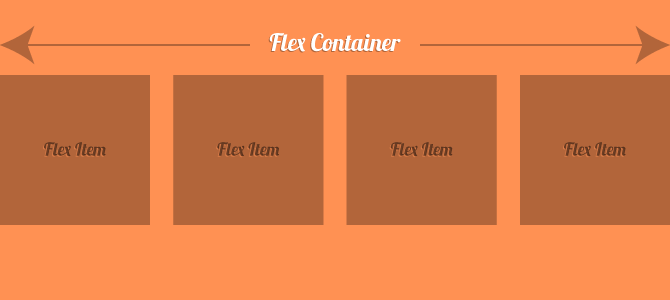
let's begin with simple example, let's add some boxes (flex elements) inside an conatiner (flex container):
- Did you see how the layout of the flex elements order? Here CSS ordered elements one by one, start from the Main Axis and put them horizontally according to its direction which is by default is the row(horizontal direction).
So,this is the most basic usage of flexbox, now let's play with the direction of flex:
row (default)
Here the elements will start order from left and right.
row-reverse
Here the elements will start order from right to left.
column
Here the elments will start order from top to bottom.
column-reverse
Here the elments will start order from bottom to top.
Manage Extra Space#
right now let's learn how to manage the extra space in the flex system, let's start in manage the space in the main axis:
here we will assume two things:
1- space is the space in the Main Axis
2- the direction is row (horizontally)
we can manage the main axis space using justify-content in flex-container:
center
Here the elements will place at the center and extra spaces will be around them
flex-start
Here the space will place after the last element
flex-end
Here the space will place before the first element.
space-between
Items display with equal spacing between them.
space-around
Items display with equal spacing around them.
This image, taken from an CSS-Tricks article on justify-content, does a good job illustrating the difference between the values listed above:

here we will assume two things:
1- space is the space in the Cross Axis
2- the direction is row (horizontally)
flex-start
Here the extra space (of the cross axis) will be bellow flex-elements.
when i mean after all elements I mean the elements will start to place into the container from where the flex-start in the cross axis.
flex-end
Here the extra space (of the cross axis) will be above flex-elements.
center
Here the extra space (of the cross axis) will be distributed equally above and bellow flex-elements which will make the element in the middle of cross axis.
Flex-Elements Order:#
flexbox provides a way to determine the order of each element, which is a property you can use in flex-elements.
default value for order property is zero
flexbox start placing elements from lower to larger values example:
so we have the following values : 2, -1, 3, 4 so CSS we reorder them to -1 -> 2 -> 3 -> 4
and the final result will be :

Exercise:#
we have a brillient practical exercise for you here we will solve it with each other
that's it for additional reading about things like align-content you can following links: Additional Resources